
Billy Steinberg
Site Redesign
Overall, the site was redesigned to better showcase Billy's career and have a more modern feel while still retaining the "artistic" touch of the original site. A handwritten font (Amatic SC) and bright color palette evocative of the 80s pop style were used to complement the varied album covers. The information which on the old site was primarily text-based and very compact was made more visual and organized more spaciously to be absorbed and browsed more easily.

Home page - before

Home page- after
Home page, before and after. It emphasizes awards as well as top hits people will immediately see and recognize.
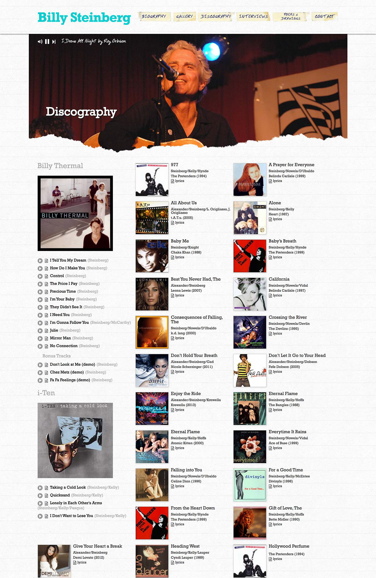
Discography page - before
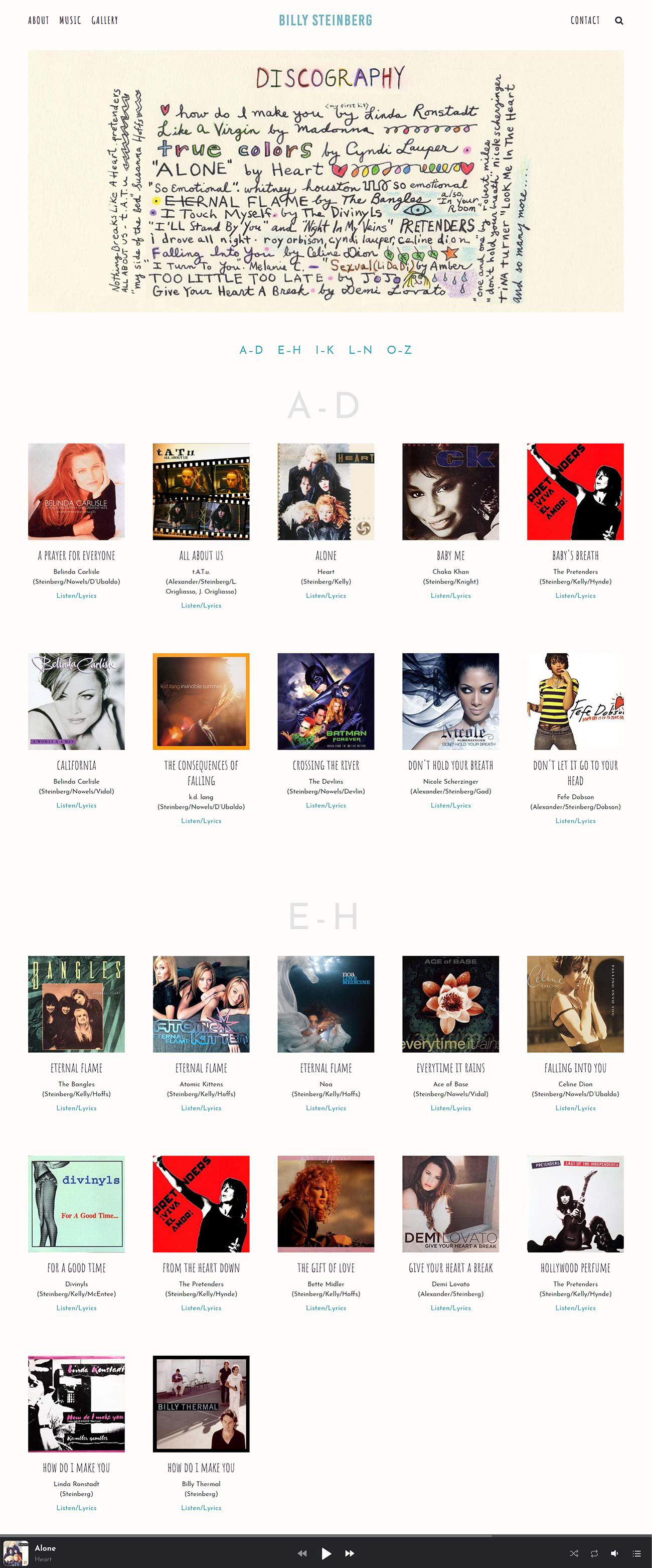
Discography page - after
Discography page, before and after. Addition of alphabetical labels with anchor links to easily locate a song.
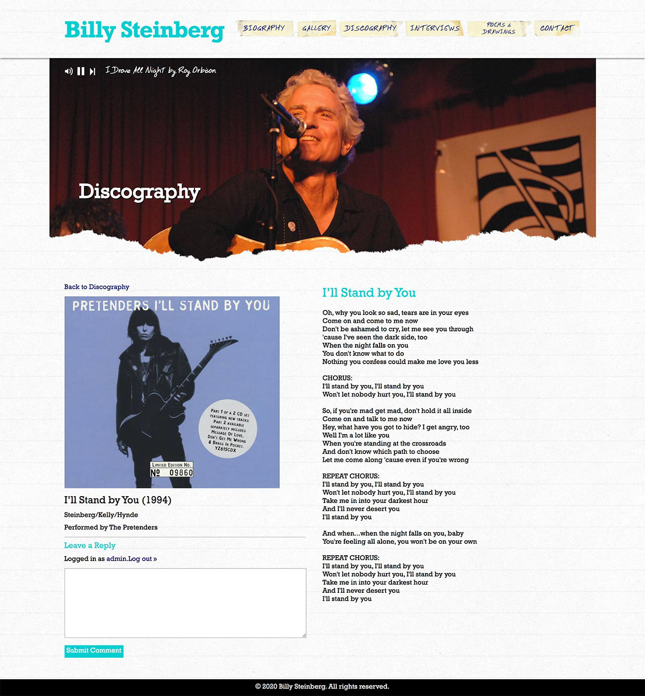
Lyrics page - before
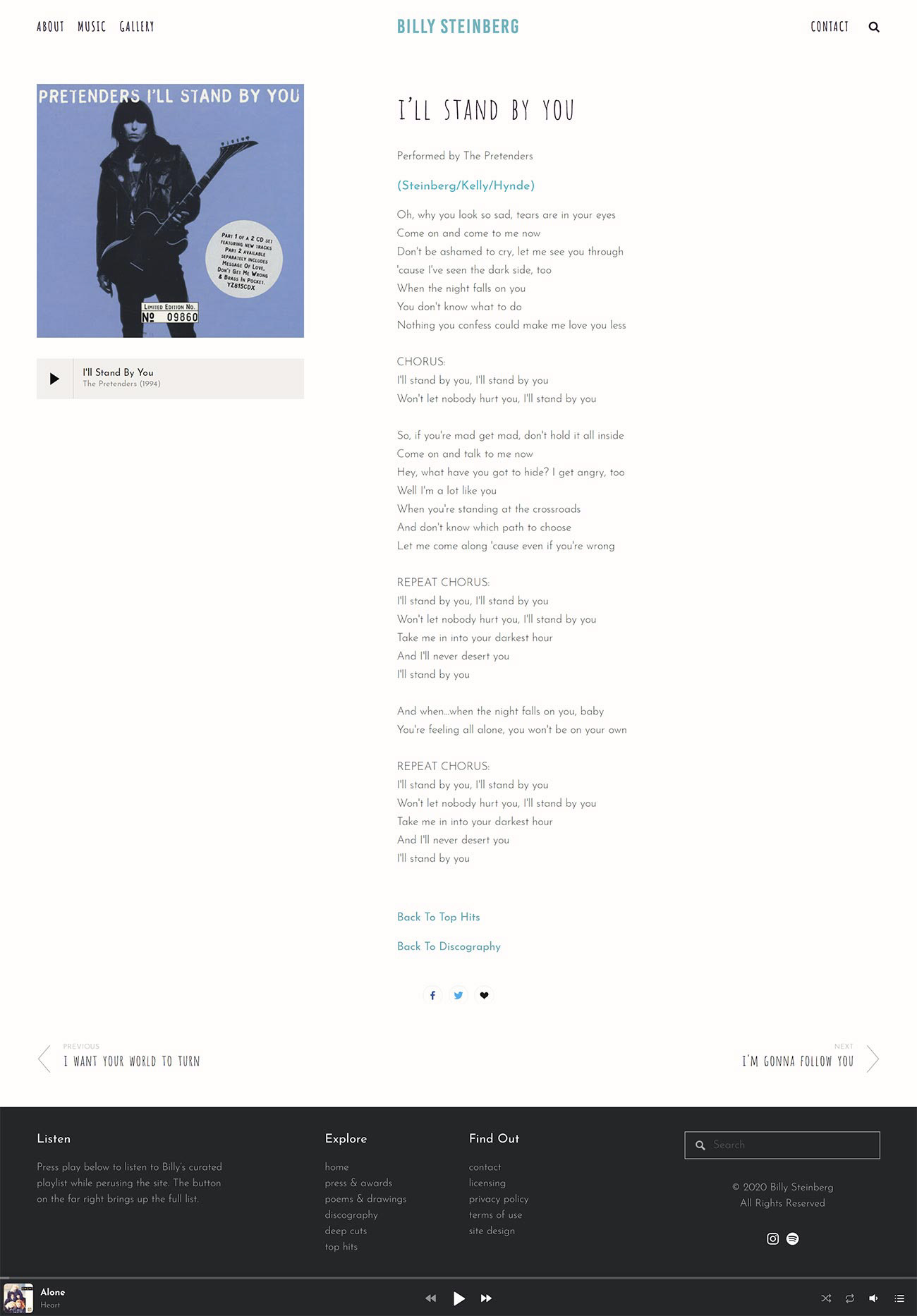
Lyrics page - after
Lyrics page, before and after.
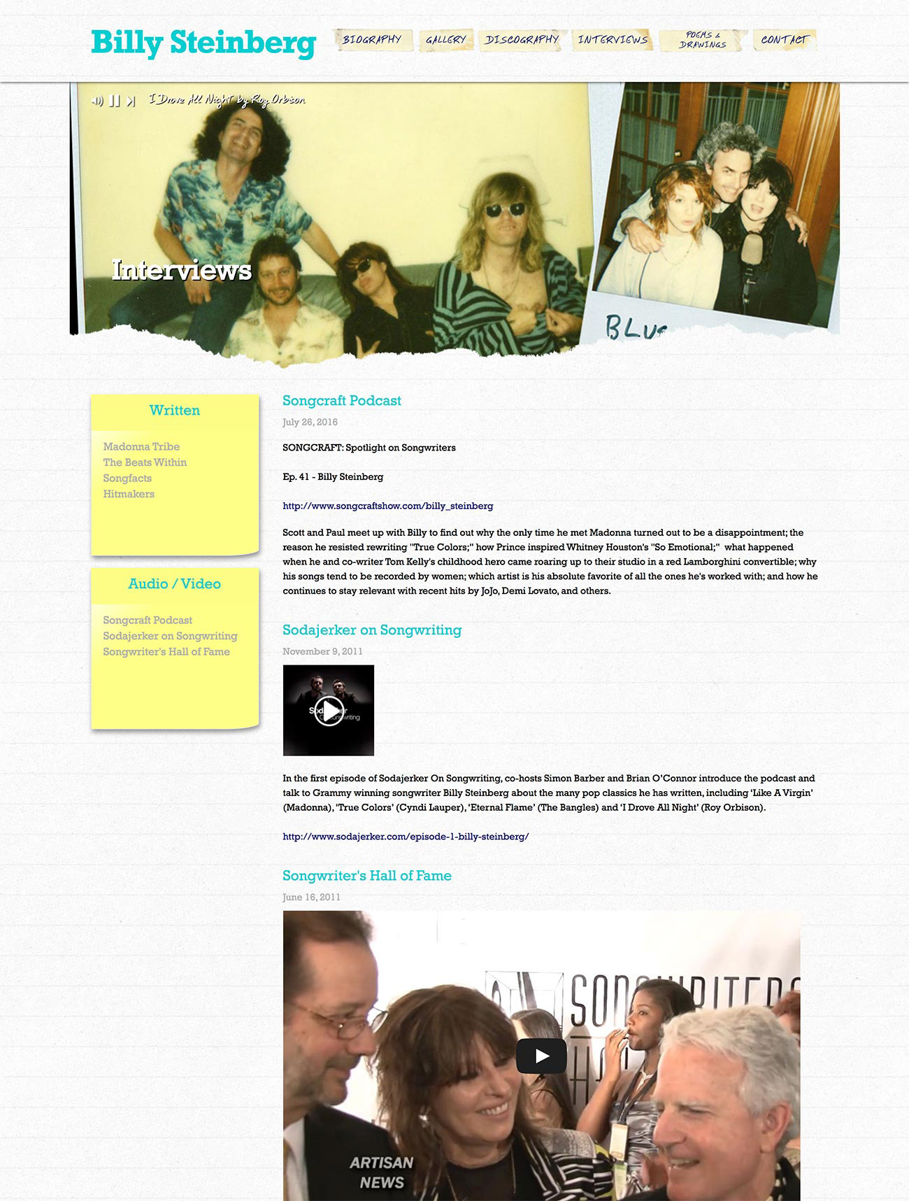
Interviews page - before

Press & Awards - after
Interviews page, before and after. Renamed "Press & Awards" and reorganized into a blog with fully designed articles.
Gallery page - before

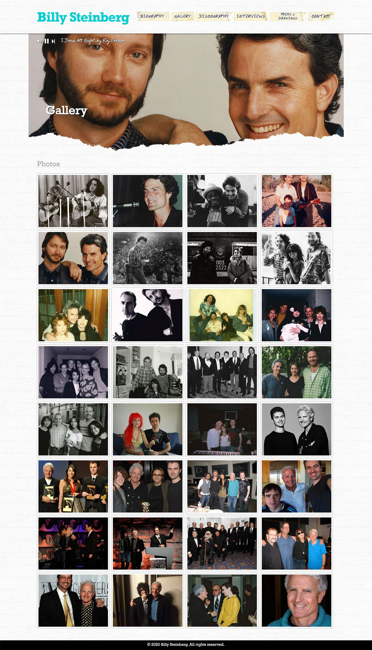
Gallery page - after
Gallery page, before and after. Reorganized with labels to present photos by decade.
Poems & Drawings page - before
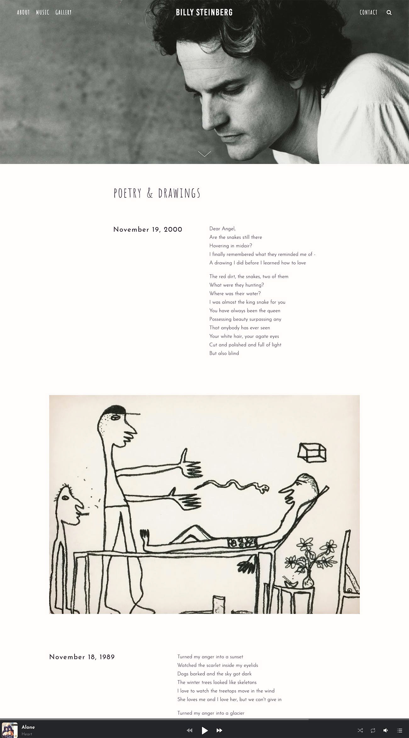
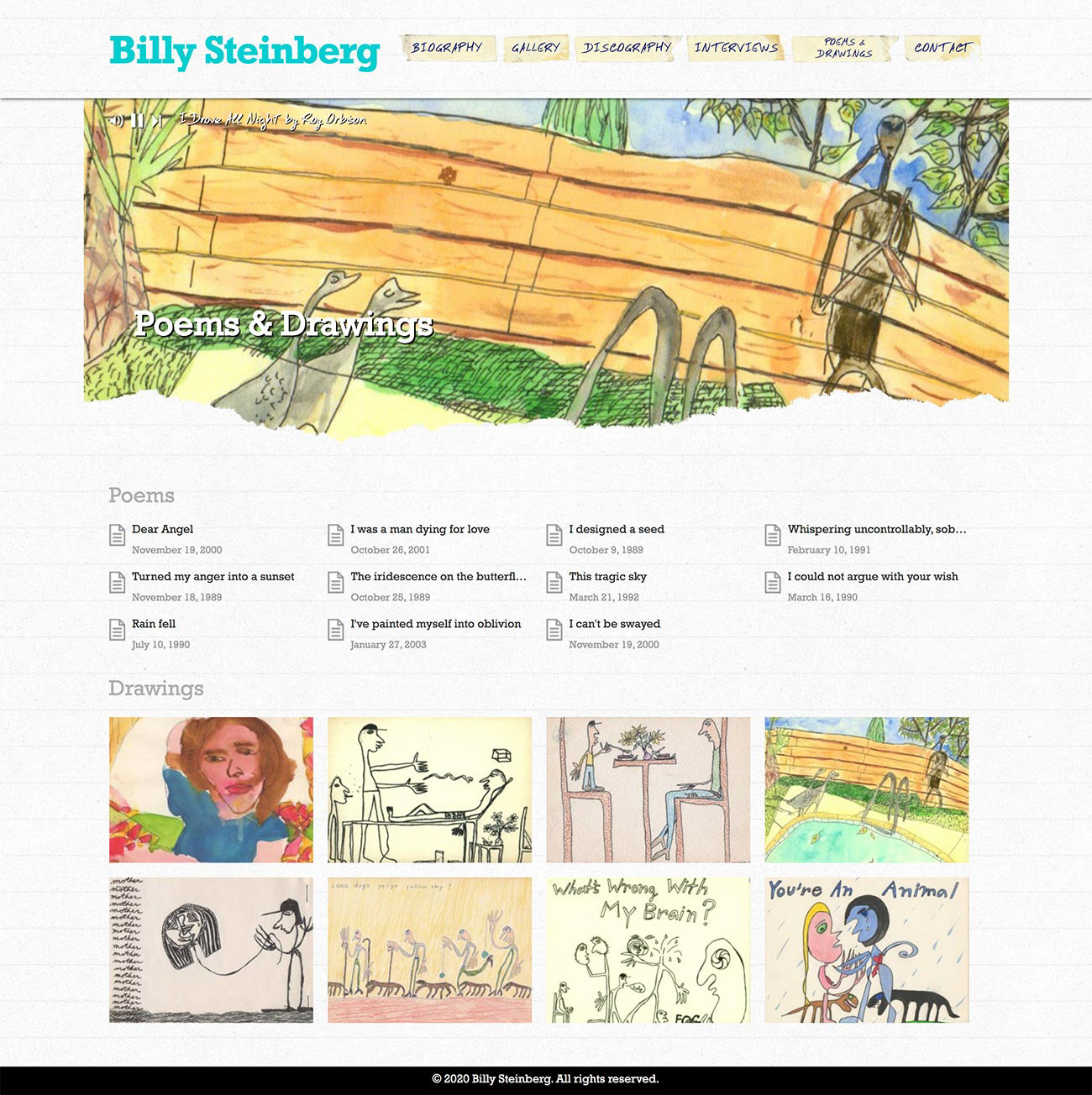
Poems & Drawings page - after
Poems & Drawings page, before and after. Improved reading experience and presentation of the poems and drawings.
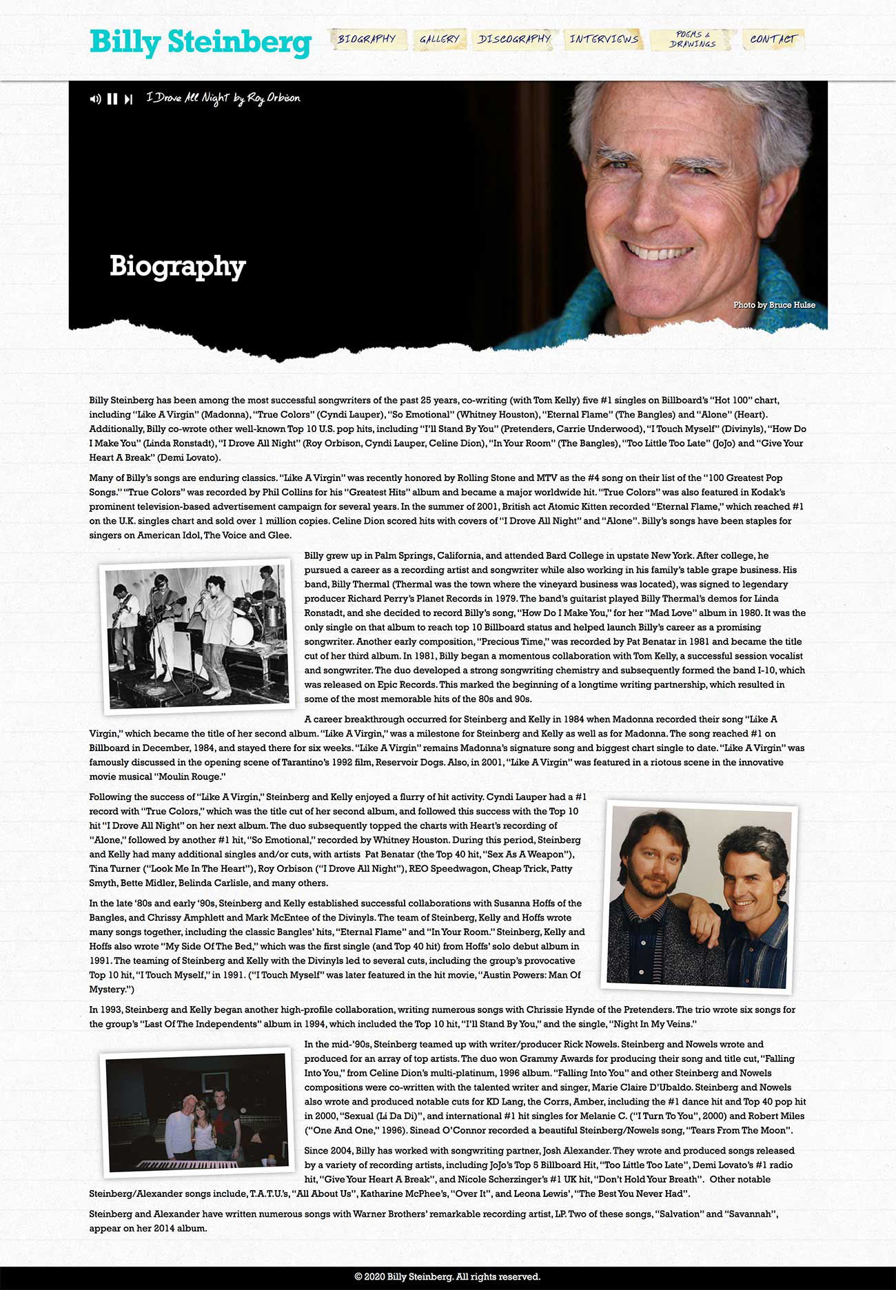
Biography page - before
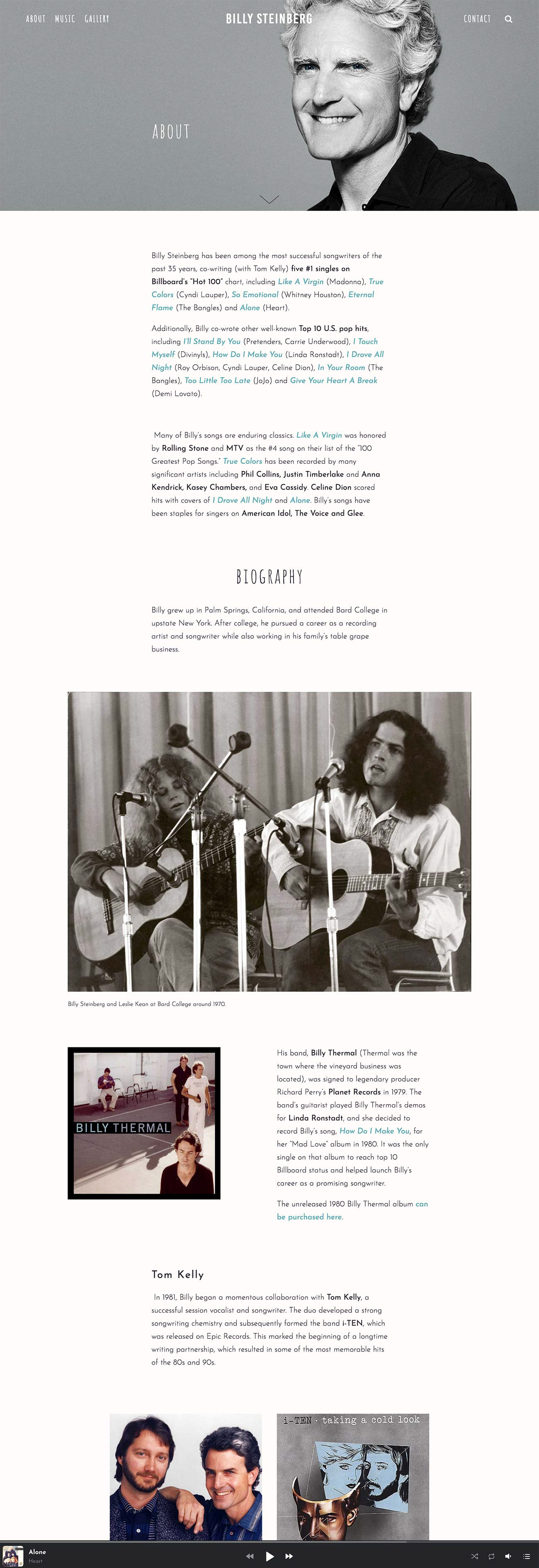
About page - after
Biography page, before and after. Renamed About to include both a career summary and easier to read biography.
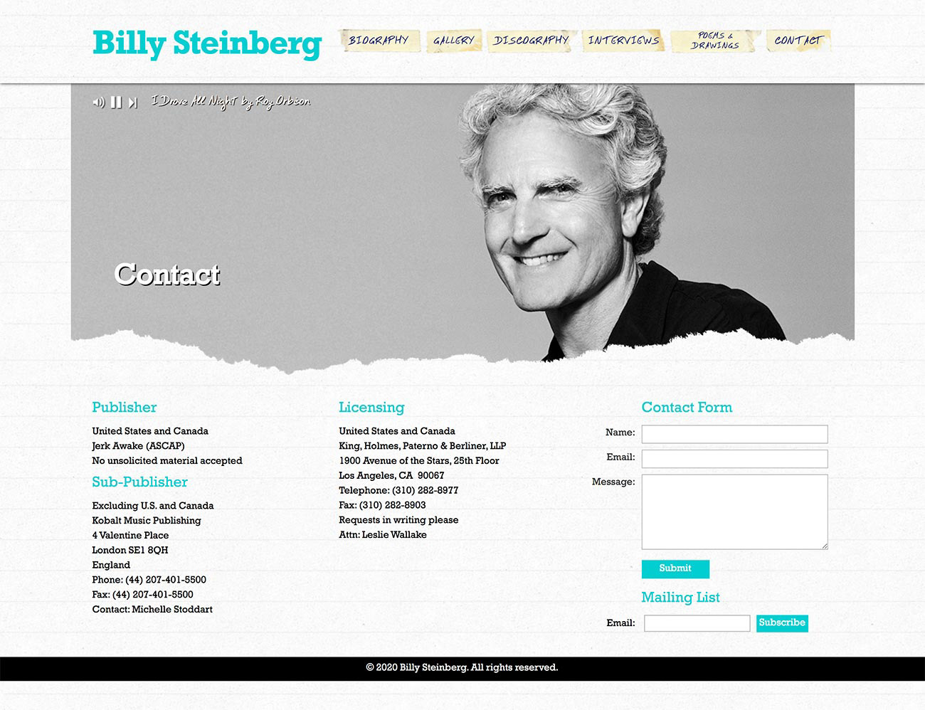
Contact page - before
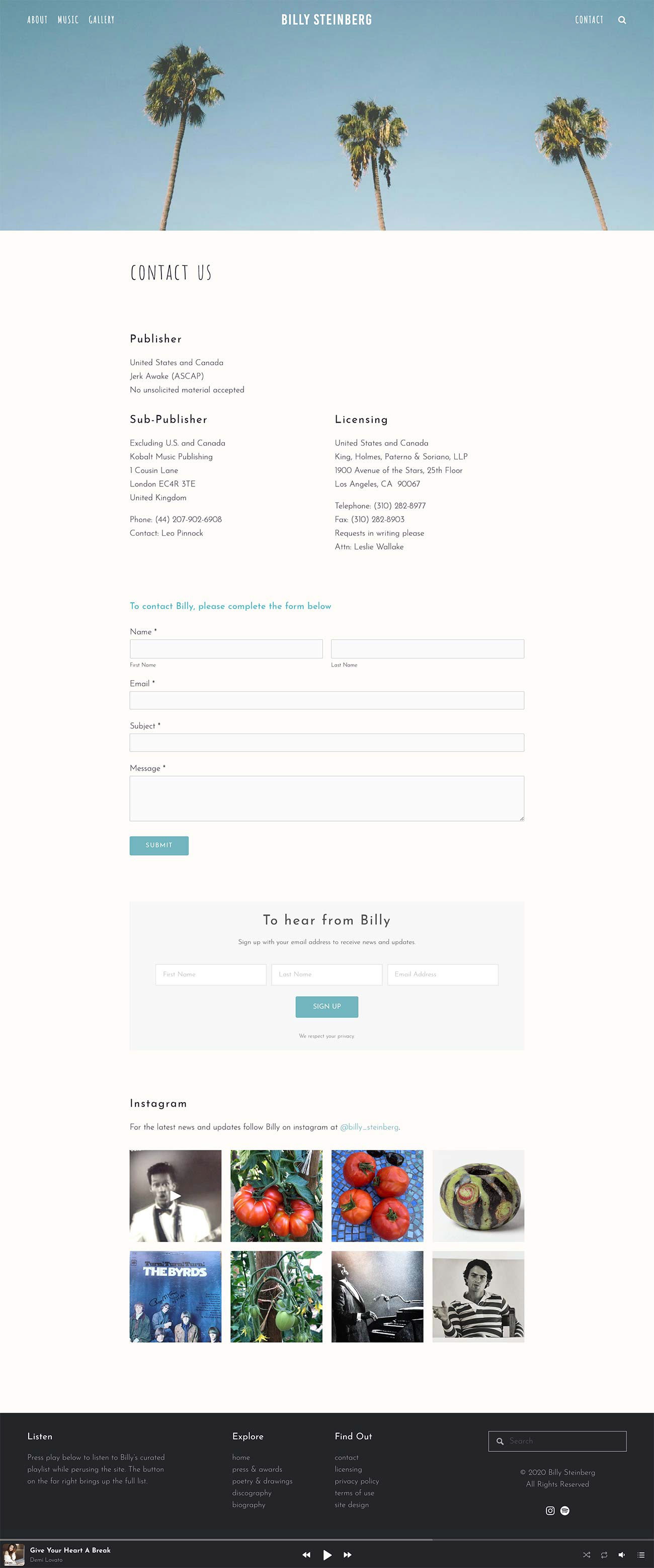
Contact page - after
Contact page, before and after. Redesigned to include a newsletter form and instagram feed.