
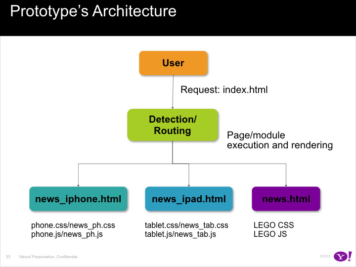
Integration of responsive behavior for Yahoo! Media properties at the time mobile platforms became mainstream and the screen size landscape widened with the addition of phones, tablets and TVs.
Screens And Grid Sizes
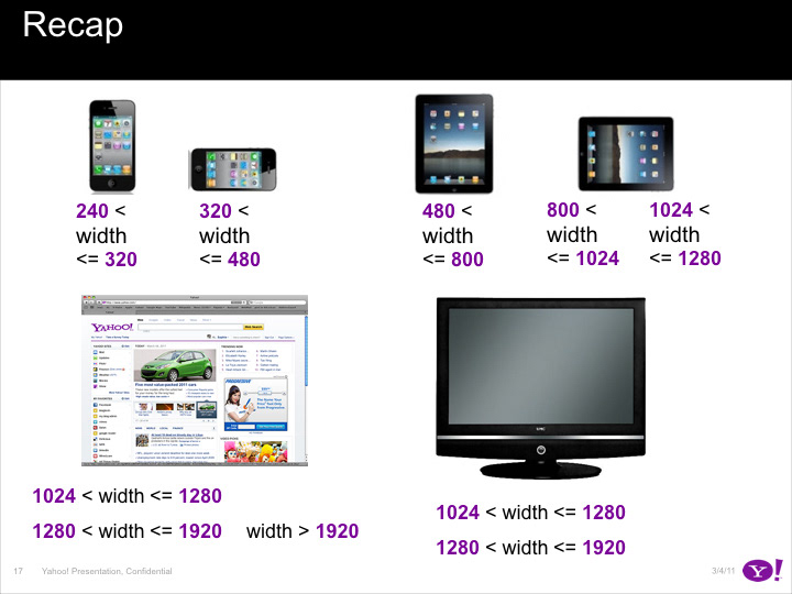
The first step was to survey the different sizes attached to the most popular devices on the market as preliminary research (click here or large image below for PDF).
CSS Framework
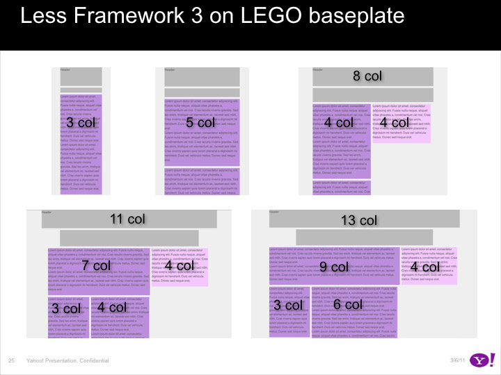
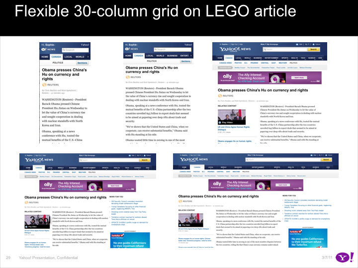
Starting with the 30-column grid the following step was to delve deeper into the CSS framework for each device (click here or on image below for a presentation PDF made to engineering). Along the way testing favored the use of a 24-column grid made fluid with percentage-based columns.
Navigation
The desktop page had a complex two-level navigation, and we had to find a way to adapt this in the restrained mobile space. Below are images of the prototypes testing a popup menu navigation scheme for the phone and tablet respectively (once there click on top right arrow button to activate the navigation menu).


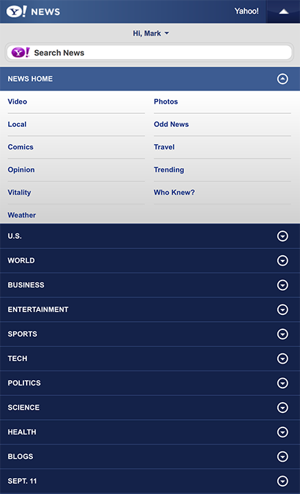
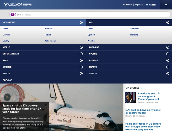
The inline design caused performance issues because of the large amount of pixels that had to be displaced each time the menu expanded. And it would push the content too far down the page so we chose to go with the popup menu option.
Swipe Interactions
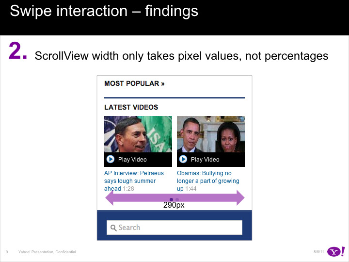
Another big change to address with migrating to mobile was the touch screen and swipe interactions. The YUI team had put in place a scrolling component but it had a number of issues such as interference with page scrolling, non-percentage base settings, pagination. Click here or on the image below for a presentation PDF of the prototype findings to the engineering and YUI teams.
Font Specifications
Finally, we had to adapt font sizes for optimal readability on phones and tablets. This for all text elements such as headline, byline, body, section headers, and captions. Click here or the image below for an example PDF of the specifications for the article page on the phone.